With retirement and cataract surgery opening a new chapter in my life, it was time to rename my blog. I am no longer waiting for that "someday" to come; it is here and now.
Sunday, January 31, 2016
Saturday, January 30, 2016
Wednesday, January 27, 2016
Sunday, January 24, 2016
Saturday, January 23, 2016
Friday, January 22, 2016
Yes!
When I heard the mention of snow lat weekend, I rushed to the quilt store to buy material for the border. Whenever there is snow in the forecast, I make sure I have the essentials in the house-fabric needed for my projects.
I will choose a backing and batting from my stash. Tomorrow, I will sandwich it and begin quilting.
I will choose a backing and batting from my stash. Tomorrow, I will sandwich it and begin quilting.
Wednesday, January 20, 2016
Just the Left Hand Left to Do
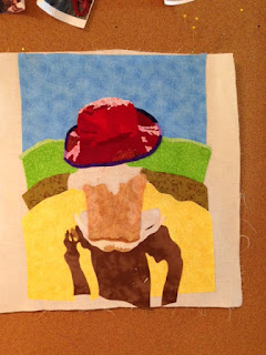
I have to admit that doing figures is still a challenge for me, but one I plan to overcome. My main nemesis is choosing the fabric for the flesh tones. I don't know why I allow this to stump me. I wasted more time and material trying to get everything to my liking. I think I finally accomplished a pretty good portrayal of the baby pictured. I just need to finish the left hand. Then I will add the border. After that I will sandwich the quilt, and sew.
Sunday, January 17, 2016
Monday, January 11, 2016
Sunday, January 10, 2016
Back on Track
While I was home on my winter break I had a vision and I went with it. Then the break was over, went back to work, and left my vision behind. I was struggling last week and had to walk away from the wall-hanging. Pinned it to my design board, and just stared at it when I had the time, knowing it was not going in the direction I wanted it. Finally yesterday, I connected with the piece again and I feel I am back to my original vision; back on track.
The yellow in the pool was too bright and too intense. This meant the body color on the baby had to be even more so. So, I took the pool bottom apart and decided to piece the bottom with less intense colors and give it a "feel" to complement the hat. I didn't want a definite pattern to the bottom, so I purposefully broke the pattern. I think mission accomplished; need to finish piecing the pool bottom (need to add more rows). The olive green shading will come off. I will use Inktense pencils and thread painting for the shading on the pool sides and bottom.
I am auditioning new and less intense body colors.
Wednesday, January 6, 2016
When Thinking Interferes with Seeing
I remember my Aunt Jodi telling me not to let thinking interfere with seeing. The last couple of days I seem to have forgotten that advice when it came to the skin tone of the baby. I was thinking of the light pinks of a baby's skin, whereas in the picture that was not what I was seeing. nI wasted several pieces of material until it suddenly dawned on me tonight........see, don't think.
The material is the color I would think of a baby's skin in the sun, but looking at the picture, I wasn't seeing what was there. Also, the green for the pool was all wrong and the shadow from the pool was off.
After "seeing and not thinking"; I changed the pool color, the shadow and the skin color. I think the shadow cast by the baby is too dark, but I am not sure. I will finish the baby first then decide.
Sunday, January 3, 2016
Pool Choices
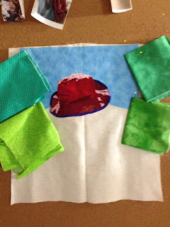
I am considering shades for the pool. I am not sure I like the lime green that matches the color in the photo. I think it would take prominence or fight the hat for prominence in the piece. I don't want it to become the focal point. The top left and right blend in too much with the sky. I think I like the bottom right. I will continue to look and consider different shades.
You may notice, I do not use a lot of plain material. When I first began making art quilts, I used plain, non patterned fabrics. As my craft has evolved, I have found using fabrics with textures and light, small patterns along adds character and pizzazz to a piece. I do use plain fabric where it is warranted.
My plan for now is to select a shade of yellow for the pool floor after the baby is pieced.
You will also notice, the wall hanging takes on different "looks" when you view it up close and from a distance. I like the look from a distance.
Saturday, January 2, 2016
Background
I have fussy cut the major parts of the hat from the material. I will add the details to the hat after I choose the background, sky, material.
This material to me is too light. I think it would work better it I want the background to have a far away look; such as the sky meeting the horizon at the beach.
This material is too busy.
too busy
This photo doesn't do it justice, but the hat pops off the background. I like the textured look of the material. The light blue pattern on the material is that of connecting hearts. I does set the hat off. If you look at the post titled Fabric Choices, you will get a better feel for the material.
Friday, January 1, 2016
Fabric Choices
Choices, choices, choices! Pattern, solid, batik, plain, bright.....fabric choices! I consider all until I find what "speaks" to me. Even then, I will have something all pieced together, only to rip it apart because it doesn't quite strike me.
I am considering these for the sky. I am leaning towards the the top two on the left. No sure, until the hat palette is selected.
I used The Art Quilter's Value Scale by Leni Wiener to help with choosing my fabric in the different palettes presented below.
I like the shades of red and patterns in this set.
I am tending to lean toward this set. I like the bright red colors and the patterns.
I think this collection is more aligned with the colors in the original picture. But and the big but, I am not excited about this set.
The border for the hat- the picture has the shades a little off.
Subscribe to:
Comments (Atom)


